In this tutorial, we will learn about Python Histograms. A histogram provides a straightforward method for visually displaying data when you’ve organized it into groups. It effectively illustrates the distribution of numerical data. In essence, it functions as a type of bar plot where the X-axis indicates the ranges, or “bins,” and the Y-axis reveals the frequency of each bin.
A histogram graphically represents data distribution. In Python, you can craft histograms with various libraries, but Matplotlib. It is one of the most commonly used libraries for this purpose. It offers a convenient way to create histograms and tailor their appearance.
Creating Python Histogram using NumPy and matplotlib
To create a histogram in Python with attributes in a tabular form, you typically use a library like Matplotlib to customize various aspects of the histogram. You can specify attributes like the number of bins, colors, labels, and more.
Different Attributes :
| Attribute | Description | Example |
| data | The data you want to create a histogram for. | data = [1, 2, 2, 3, 3, 3, 4, 4, 4, 4] |
| bins | Number of bins (bars) in the histogram. | bins = 5 |
| color | Color of the bars in the histogram. | color = ‘blue’ |
| alpha | Transparency of bars (0.0 to 1.0). | alpha = 0.7 |
| edgecolor | Color of the bar edges. | edgecolor = ‘black’ |
| xlabel | Label for the X-axis. | plt.xlabel(‘X-axis Label’) |
| ylabel | Label for the Y-axis. | plt.ylabel(‘Frequency’) |
| title | Title of the histogram. | plt.title(‘Histogram Example’) |
| grid | Display grid lines on the plot. | plt.grid(True) |
| density | Normalize the histogram (sum of frequencies = 1). | density = True |
| cumulative | Create a cumulative histogram. | cumulative = True |
| histtype | Type of histogram (‘bar’, ‘barstacked’, etc.). | histtype = ‘step’ |
| range | Specify the range of values to consider. | range = (0, 10) |
| log | Create a logarithmic histogram. | log = True |
| binsize | Specify custom bin edges. | binsize = [0, 2, 4, 6, 8, 10] |
| weights | Assign weights to data points. | weights = [0.5, 0.2, 0.3, 0.8, 0.7] |
Example :
import matplotlib.pyplot as plt
import numpy as np

# Generate some random data (you can replace this with your own data)
data = np.random.randn(1000)  # Random data with a normal distribution

# Create a histogram
plt.hist(data, bins=20, color='blue', alpha=0.7)
plt.xlabel('X-axis Label')
plt.ylabel('Frequency')
plt.title('Histogram Example')
plt.grid(True)

# Display the histogram
plt.show()
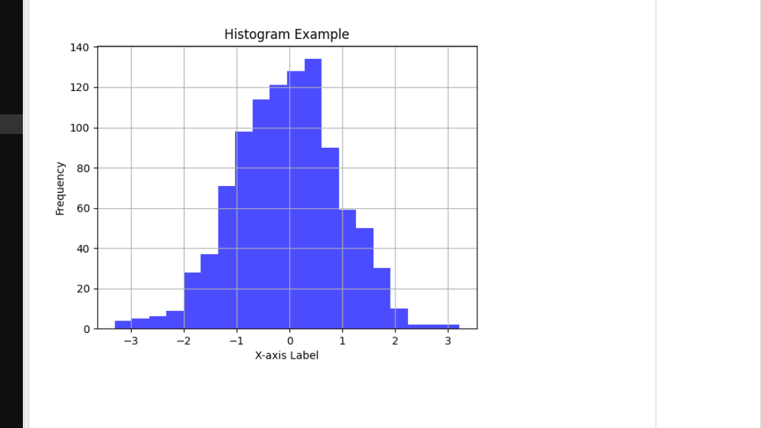
Output :
- We use necessary libraries: Matplotlib’s pyplot for creating plots and NumPy for generating random data.
- We generate random data using NumPy’s numpy.random.randn. Feel free to replace this with your own dataset or load data from a file for specific visualization needs.
- We construct the histograms using
plt.hist(). The ‘bins’ parameter allows you to control the number of bars in the histograms, providing flexibility to adjust the granularity. - We include labels for the X and Y axes and assign a title to the plot.
- To enhance visualization, we enable grid lines with
plt.grid(True). - Finally, we reveal the histogram by executing
plt.show().
How to Customize Python Histogram in Matplotlib
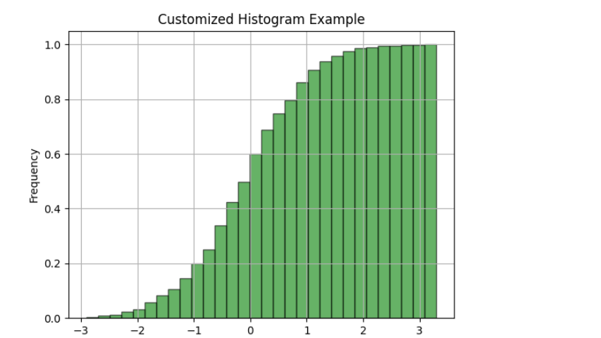
Matplotlib offers various methods for customizing histograms. Notably, the matplotlib.pyplot.hist() function offers an array of attributes that allow us to tailor a histogram to our specific needs. This function also provides a ‘patches’ object, granting access to the properties of the created objects. Utilizing this, we can easily make further adjustments to the plot as desired.
import matplotlib.pyplot as plt
import numpy as np

# Generate random data with a normal distribution
data = np.random.randn(1000)

# Create a histogram with custom attributes
plt.hist(data, bins=30, color='green', alpha=0.6, edgecolor='black', density=True, cumulative=True)
plt.xlabel('Value')
plt.ylabel('Frequency')
plt.title('Customized Histogram Example')
plt.grid(True)

# Display the histogram
plt.show()
Output :
How to Create Multiple Histograms in Python
Constructing multiple histograms in Python with Matplotlib proves to be a valuable technique when comparing distributions of various datasets within a single graph.
import matplotlib.pyplot as plt
import numpy as np

# Generate two sets of random data
data1 = np.random.normal(0, 1, 1000)  # Data with mean 0 and standard deviation 1
data2 = np.random.normal(2, 1, 1000)  # Data with mean 2 and standard deviation 1

# Create histograms for both datasets
plt.hist(data1, bins=20, color='blue', alpha=0.5, label='Data 1')
plt.hist(data2, bins=20, color='red', alpha=0.5, label='Data 2')

# Customize the plot
plt.xlabel('Value')
plt.ylabel('Frequency')
plt.title('Multiple Histograms Example')
plt.legend()  # Display legend to differentiate between data1 and data2
plt.grid(True)

# Display the histogram
plt.show()
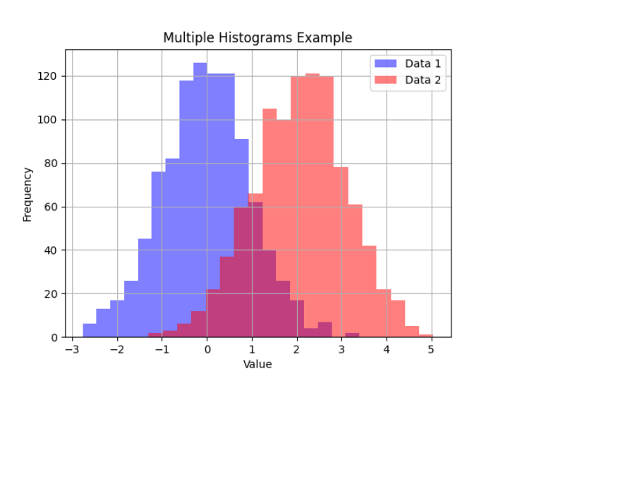
Output :
- First, we import the necessary libraries, which include Matplotlib and NumPy.
- Next, we generate two sets of random data using NumPy’s
np.random.normalfunction. Specifically, we create ‘data1’ by sampling from a normal distribution with a mean of 0 and a standard deviation of 1. ‘data2’ is generated from a normal distribution with a mean of 2 and a standard deviation of 1. - Moving on, we proceed to create histograms for both datasets employing
plt.hist. Within this step, we specify various parameters such as the number of bins, colors, and alpha (which controls transparency) for each histogram. We also utilize the ‘label’ parameter to assign labels for the legend, aiding in dataset differentiation. - Afterward, we enhance the visualization by including labels for the X and Y axes, setting a plot title, and enabling grid lines.
- To distinguish between the two datasets in our plot, we effectively employ
plt.legend()to display a legend. - Finally, to showcase our histogram, we utilize
plt.show().


