
There is a property for designing which is called CSS background opacity that helps the user in specifying the opaque/ transparency of an object. These properties can have values from 0 to -1. The lower the value, the more transparent object will be. For example, if the opacity of an object is 0.2, the object will be more blurry. If the opacity will be 0.5, the object will be less blur as compared to 0.2. The default opacity of an element can be 1 and it is the most suitable position. The user can apply this property when the child class inherits the features.
CSS Background Opacity Example
<html>
<head>
<style>
image {
opacity: 0.2;
}
</style>
</head>
<body>
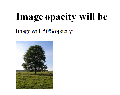
<h1>Image opacity will be</h1>
<p>Image with 50% opacity:</p>
<img src="tree.jpg" alt="Tree" width="100" height="80">
</body>
</html>The output of the above CSS code will be:
There is also a feature for CSS background opacity which is performed using hover: This will change the opacity of the image to default 1 on mouse hover. When the user uses opacity in code, its child elements automatically inherits the properties and function accordingly.
There is another concept which is called RGBA values. It does not apply to the child elements or any further elements. We use rgba() function to execute the opacity. The user can choose as up-to how much value he wants to create the opacity or transparency. It does not only depend on the value but also depends on how the image will vary according to the set opacity value. Its property will reflect as a feature when the child class inherits the features.
CSS background opacity Program using RGBA values
<html>
    <head>
        <title>rgba property</title>
        <style>
            h1 {
                color: red;
            }
            h1, h2 {
                text-align: center;
            }
            div {
                background: rgb(0, 151, 19);
                padding: 10px;
                text-align:justify;
            }

            div.first {

                background: rgba(0, 151, 19, 0.1);
            }

            div.second {

                background: rgba(0, 151, 19, 0.3);
            }

            div.third {

                background: rgba(0, 151, 19, 0.6);
            }
        </style>
    </head>
    <body>
        <h1>Welcome to Developer Helps</h1>
        <h2>RGBA colors</h2>
        <div class="first">
            <p>This paragraph has 10% opacity.</p></div>
        <div class="second">
            <p>This paragraph has 30% opacity.</p></div>
        <div class="third">
            <p>This paragraph has 60% opacity.</p></div>
        <div><p>This is default value = 1.</p></div>
    </body>
</html>
The output of this program will be:
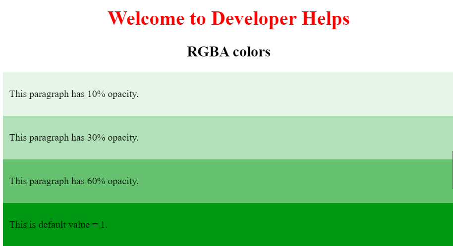
Here, in this code, each color will define the intensity of the opacity as shown. The intensity tends to lie between 0 to 255. each colour will have it’s own RGB values.